Packaging Design
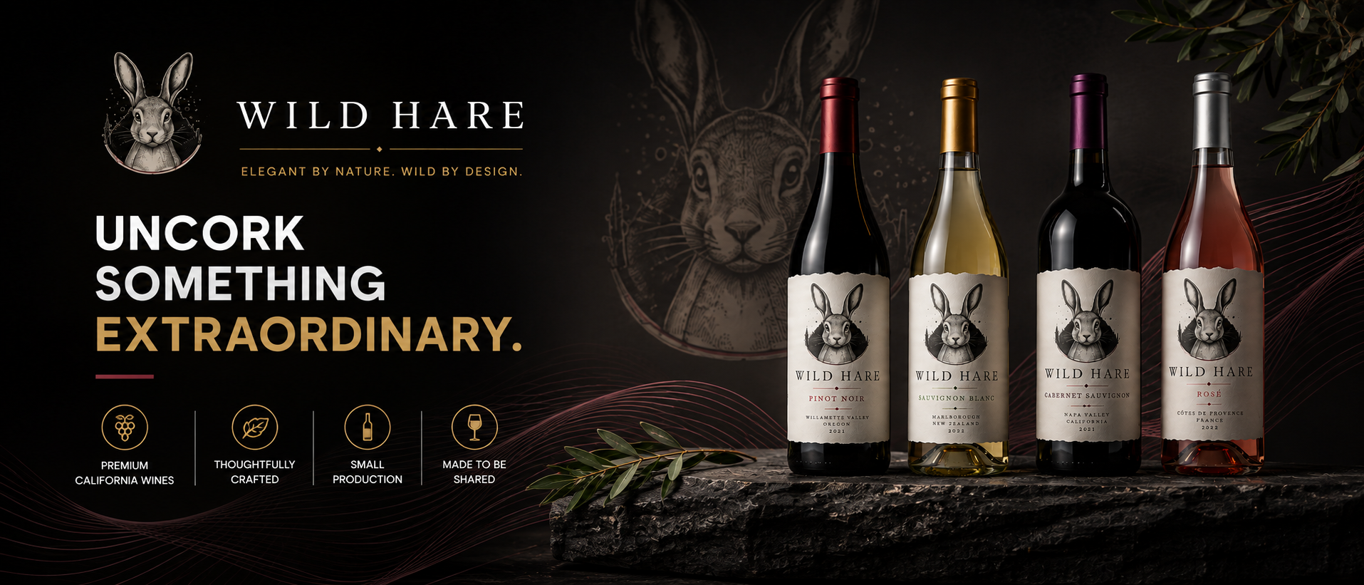
Wild Hare
Elegant by nature. Wild by design.
Custom wine packaging that pairs distinctive illustration with refined typography to create a memorable shelf presence.
Runway Rogue
Bold beauty. Made to perform.
Editorial-inspired packaging combining sleek typography, soft metallic finishes, and a refined color palette to express Runway Rogue’s confident beauty identity.

Cermak Fresh Market
Fresh flavors. Boldly expressed.
Vibrant, flavor-forward graphics bring each variety to life, creating an appetizing visual experience while giving the Cermak product line a cohesive, recognizable identity.

Simple Crave Nuts
Naturally simple. Designed to crave.
A warm, ingredient-forward packaging system featuring a playful smile-shaped window, earthy color palettes, and distinct flavor cues that give the brand personality while keeping the product front and center.

WaveVibe
Ride the sound. Feel the vibe.
A bold packaging experience built around immersive unboxing, high-contrast graphics, and electric purple accents that carry WaveVibe’s energetic identity from the outer box through the interior presentation.

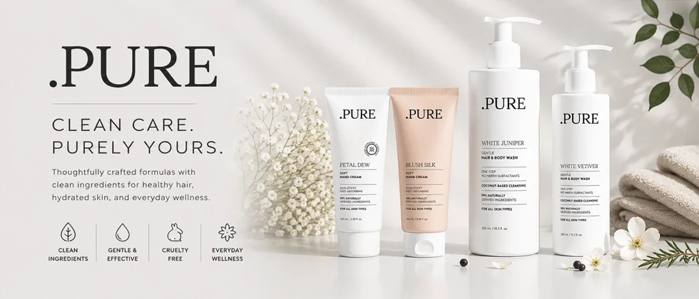
.Pure
Pure by nature. Refined by design.
A minimalist packaging system pairing soft neutrals, refined typography, and botanical cues to communicate purity, simplicity, and modern self-care.
DNA My Dog
Know more. Love them more.
Bold, approachable packaging uses playful breed graphics and clear visual hierarchy to make DNA discovery simple and engaging.

