OUR STORY
360 Realty Group takes a complete, full-circle approach to real estate. Built around the idea of 360-degree service, the identity reflects clarity, precision, and confidence at every stage of the real estate experience.
Logo Design
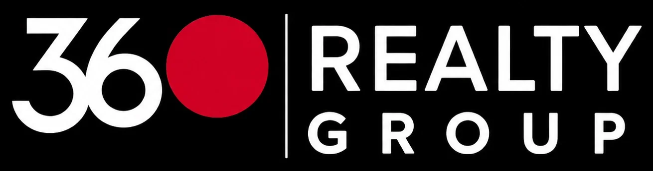
The red circle represents a complete 360 degrees, reinforcing the idea of full-circle service—from listing to closing and everything in between. Its bold, continuous form communicates completeness and confidence, while the clean, straightforward typography conveys transparency and precision. Together, these elements create a strong, modern identity centered on trust and complete service.
LOGO USAGE
To maintain a strong and recognizable presence, the logo should be applied consistently across all brand materials. Proper spacing, scale and contrast help ensure clarity and visual impact in every application.
Primary Logo

Reversed
Monochrome

COLOR PALETTE
The palette pairs bold red with black, gray and white to create a clean, confident visual system. Red adds energy and distinction, while the neutral tones provide balance, clarity and a professional foundation.
BLACK
#0A0A0A
R 10 G 10 B 10
C 75 M 68 Y 67 K 90
R 10 G 10 B 10
C 75 M 68 Y 67 K 90
RED
#E30613
R 227 G 6 B 19
C 0 M 100 Y 92 K 0
R 227 G 6 B 19
C 0 M 100 Y 92 K 0
GRAY
#D6D6D6
R 214 G 214 B 214
C 0 M 0 Y 0 K 20
R 214 G 214 B 214
C 0 M 0 Y 0 K 20
WHITE
#FFFFFF
R 255 G 255 B 255
C 0 M 0 Y 0 K 0
R 255 G 255 B 255
C 0 M 0 Y 0 K 0
TYPOGRAPHY
Our typography is modern and structured. It supports our message with clarity and authority.
Primary Typeface
MONTSERRAT
ABCDEFGHIJKLMNOPQRSTUVWXYZ
abcdefghijklmnopqrstuvwxyz
0123456789
abcdefghijklmnopqrstuvwxyz
0123456789
BOLD
SEMIBOLD
MEDIUM
REGULAR
LIGHT
APPLICATIONS
Our identity comes to life across every touchpoint. Consistency builds trust and makes our brand instantly recognizable.

BRAND ELEMENTS
Our brand elements are minimal and purposeful. They add visual interest while staying true to our identity.